Hand lettering
In my time SCAD, I signed up for a class called “Type and Image”. I was excited because I’d always done hand lettering and had always been proficient at drawing, so I figured it was going to be a piece of cake. Oh boy, was I wrong! Even though I had the natural ability to “illustrate words”, there was so much that went into creating a visually pleasing type based image than I could have ever imagined. It ended up being a challenge for me, and only furthered my enthusiasm on improving this skill. After graduation, I hand lettered a word a day for 100 days; the difference between day 1 and day 100 was palpable, and I have sought out opportunities for hand lettering projects ever since.
Shattered Glass: title treatment
Shattered Glass Studios is an up and coming animation studio whose mission is to “shatter” the glass ceiling for women and other creative minorities in the visual story telling world. I am honored to have been asked to create the title treatment for their first film, “Effacement” which tells an unsettling story capturing some of the scarier, less focused upon parts of pregnancy and childbirth.
To keep up with the goings on of this incredible studio and its creatives, please visit their website at shatteredglassfilm.com.
*All designs are the exclusive property of Shattered Glass Films and cannot be reciprocated or reused


Savannah Conserves: blade
When I developed the character “Blade” for the City of Savannah, I was also asked to hand letter the word Blade for the project! This typography was used as a header for the character pages, and I will hopefully be getting the chance to illustrate the rest of the alphabet!


The Grinch
One of the original ideas for the Grinch poster that I did for Soiree Signatures (see illustration work) involved hand lettering the word Grinch. While this didn’t end up being a part of the final design, I really loved how it came out!


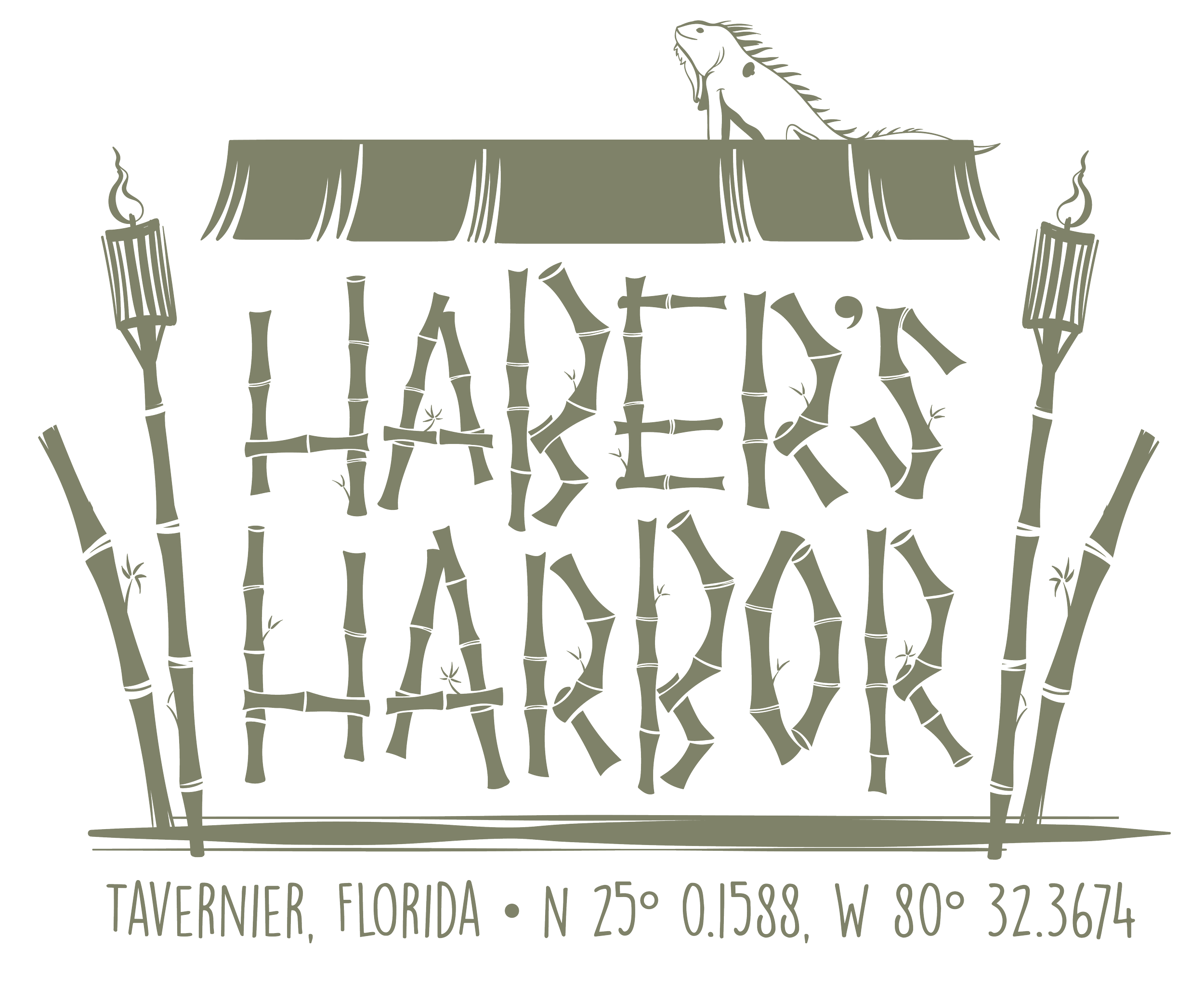
HaBer’S Harbor
A clients recently purchased a lovely littler mid-century modern home in Key West Florida and wanted to get some products made with the name they lovingly gave it: Haber’s Harbor. The couple are a fan of the tiki bar aesthetic, so we wanted to keep the style fun and funky, but also clean and versatile to go with the styling of the house. This is the chosen design, and below are a few other options that didn’t make the final cut.


